C+S HOUSE
A Minimalist Art-Filled Retreat.
Year: 2019
Location: East Hampton, NY
Project Team: AE Superlab | Brian Masuda
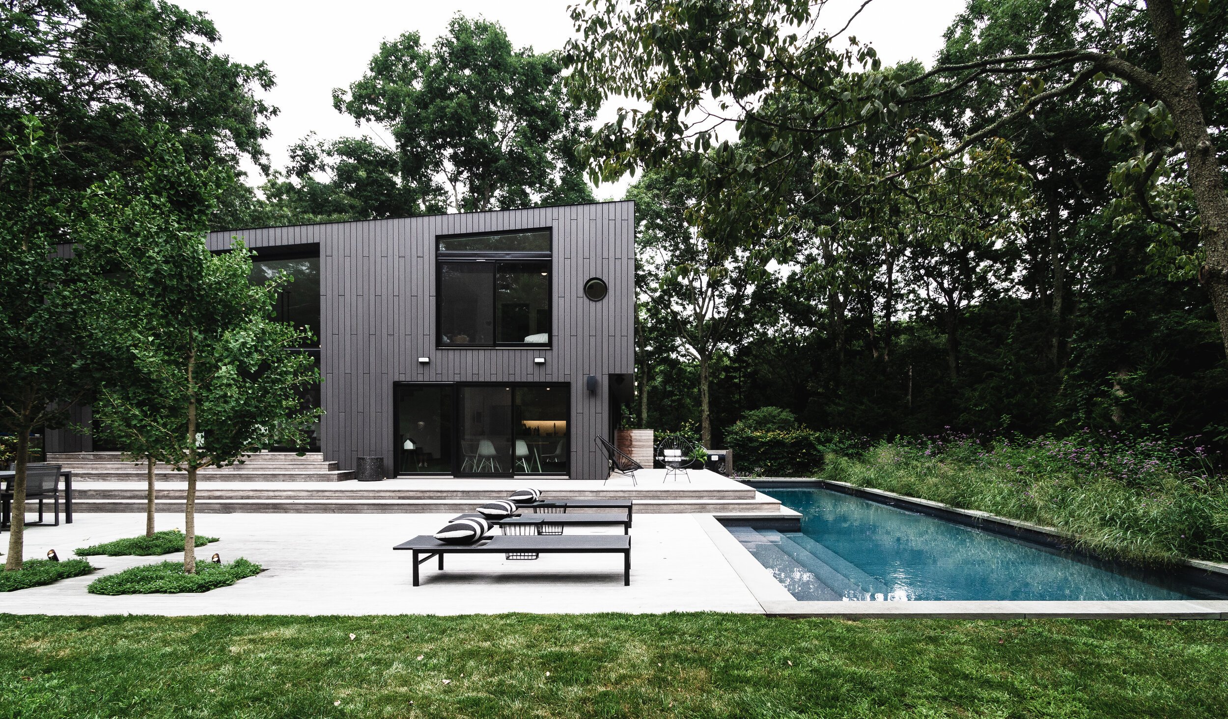
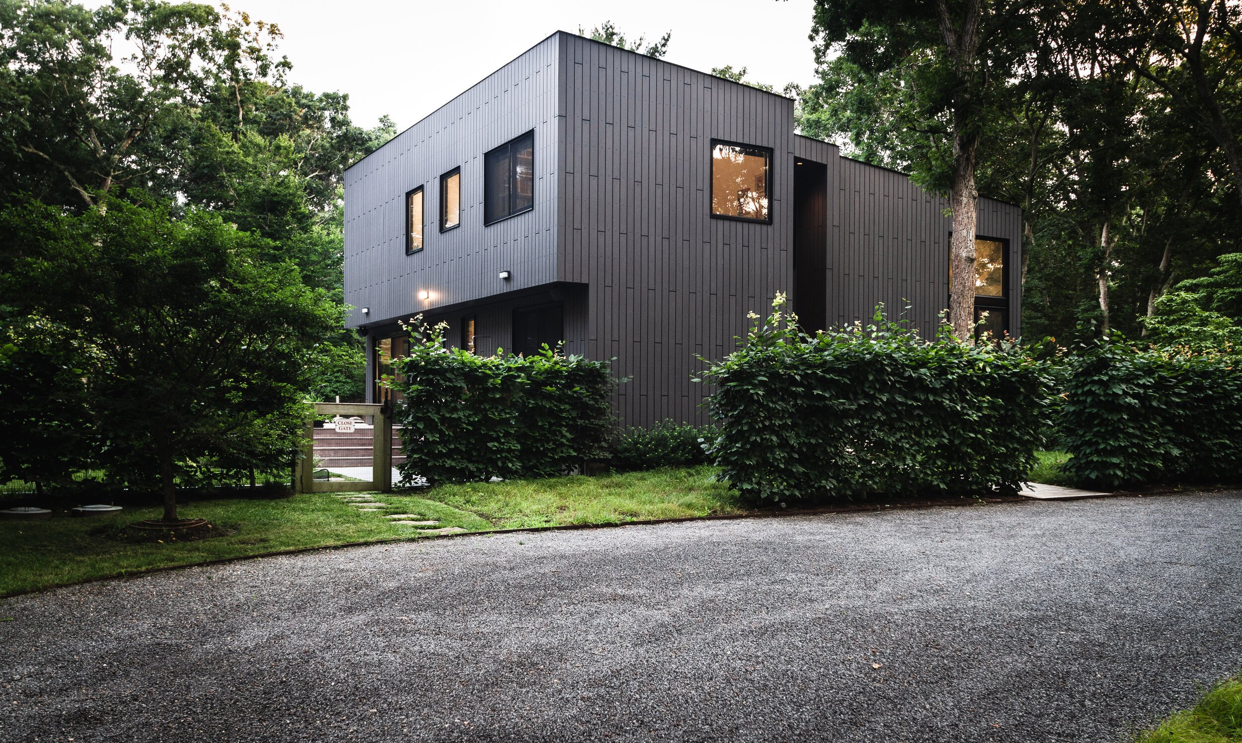
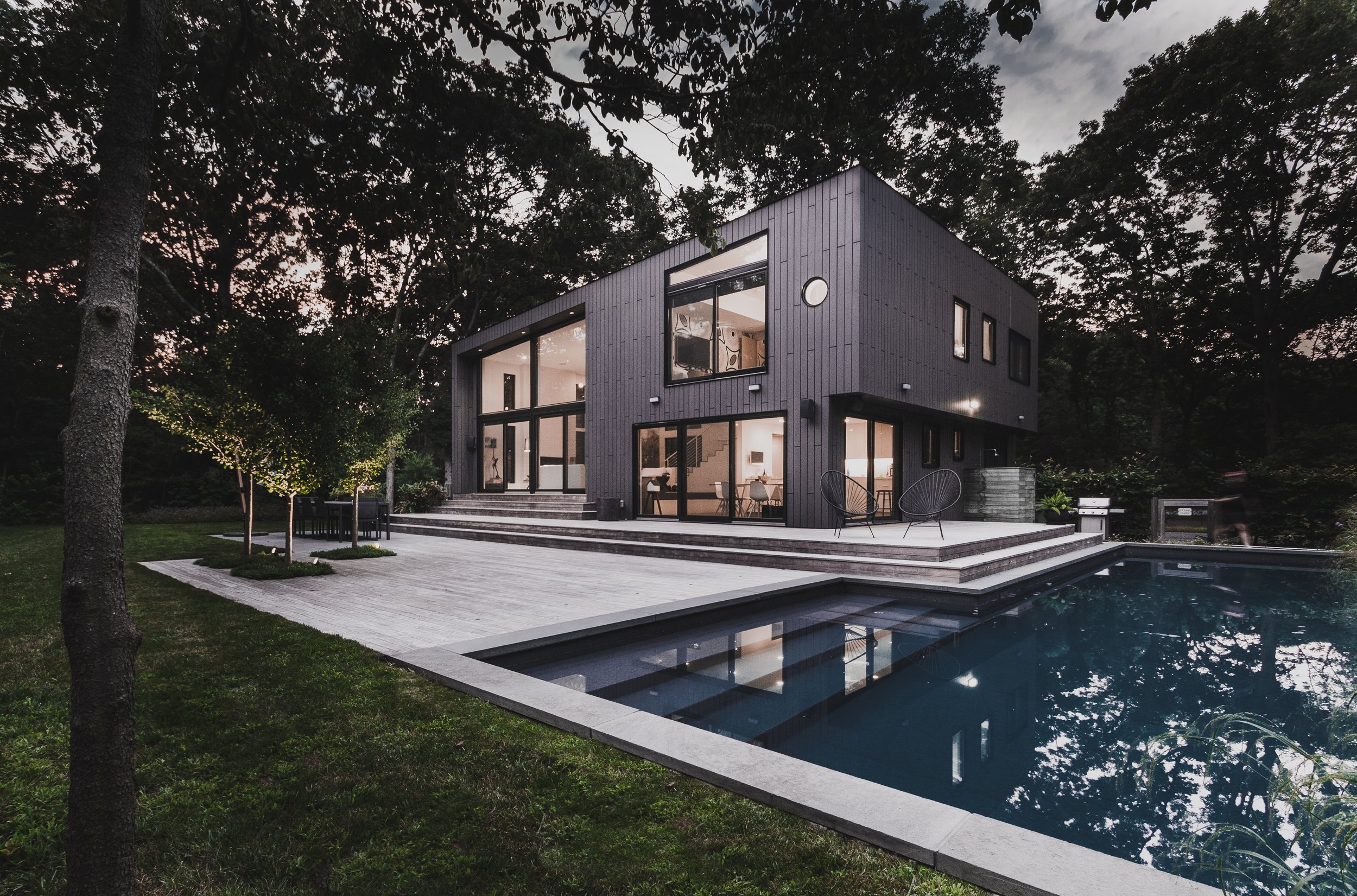
Located at the edge of a heavily wooded 3-acre plot in East Hampton, New York, The C+S house is a complete redesign and renovation of an existing 1970’s era residence and serves as a retreat for the Manhattan based clients; a graphic designer, and an art consultant and curator.
Clean lines, minimalist details and a limited but carefully selected palette of materials, breathe new life into the existing house, while retaining and building on the idiosyncratic character of the original.
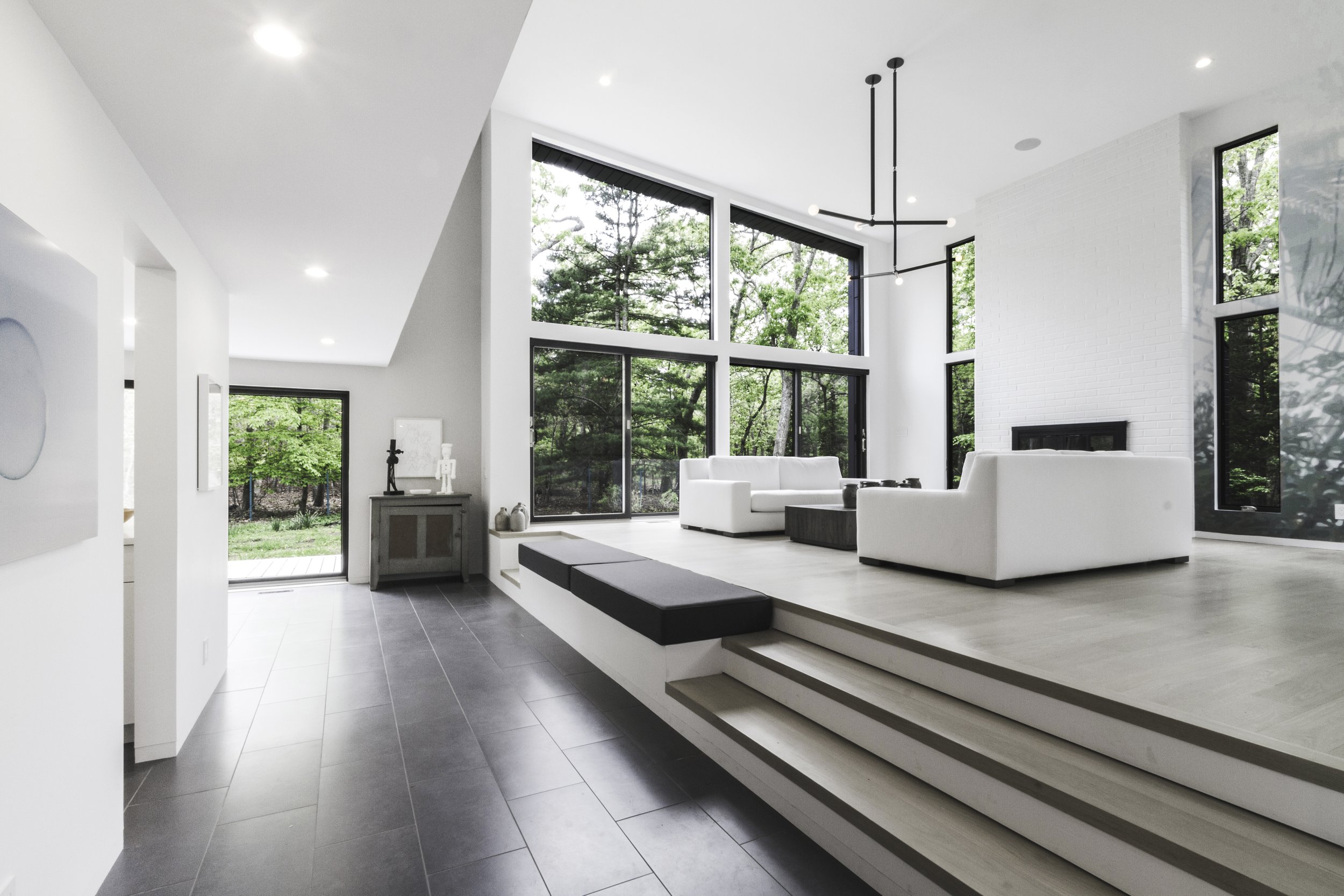
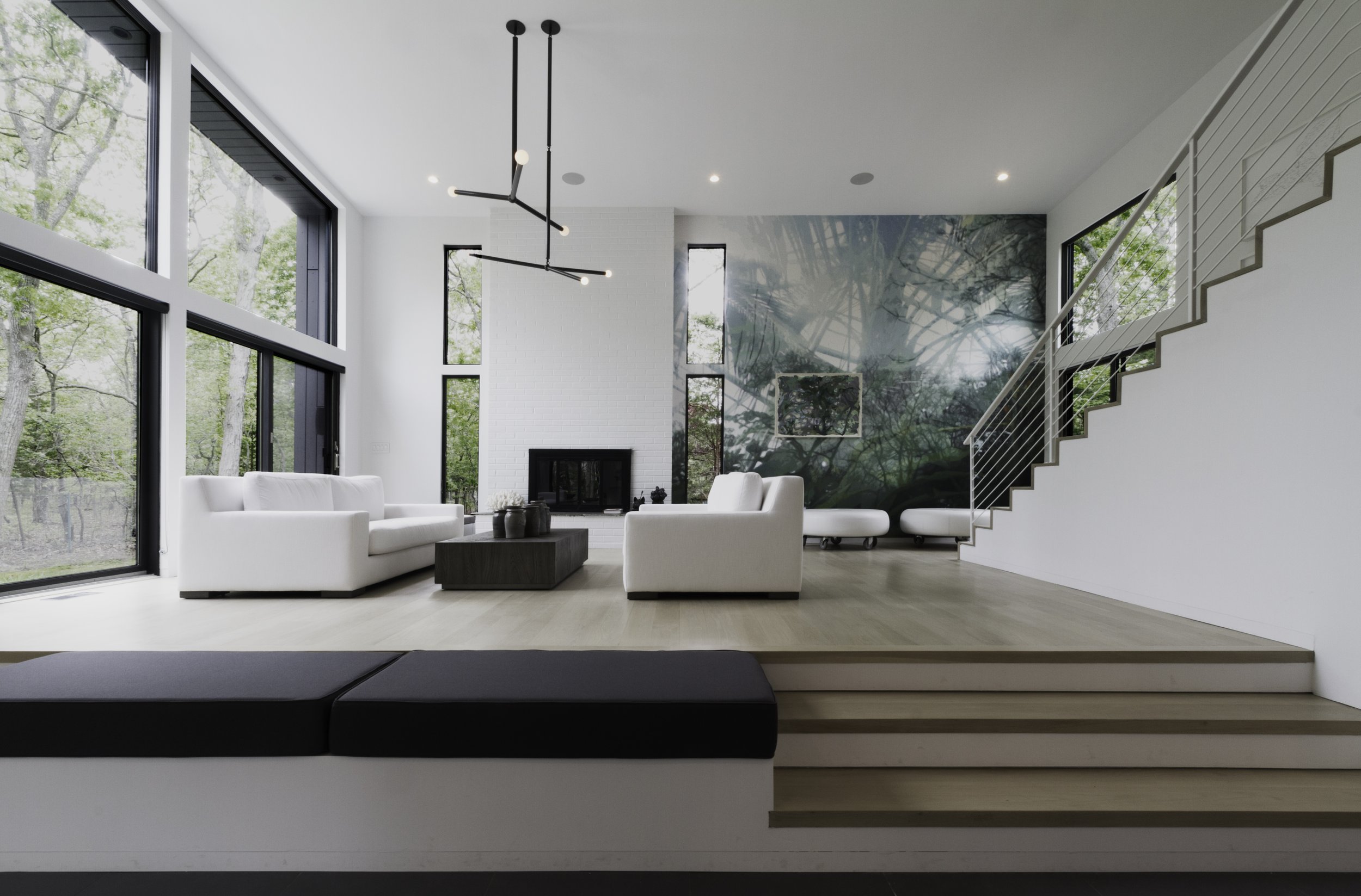
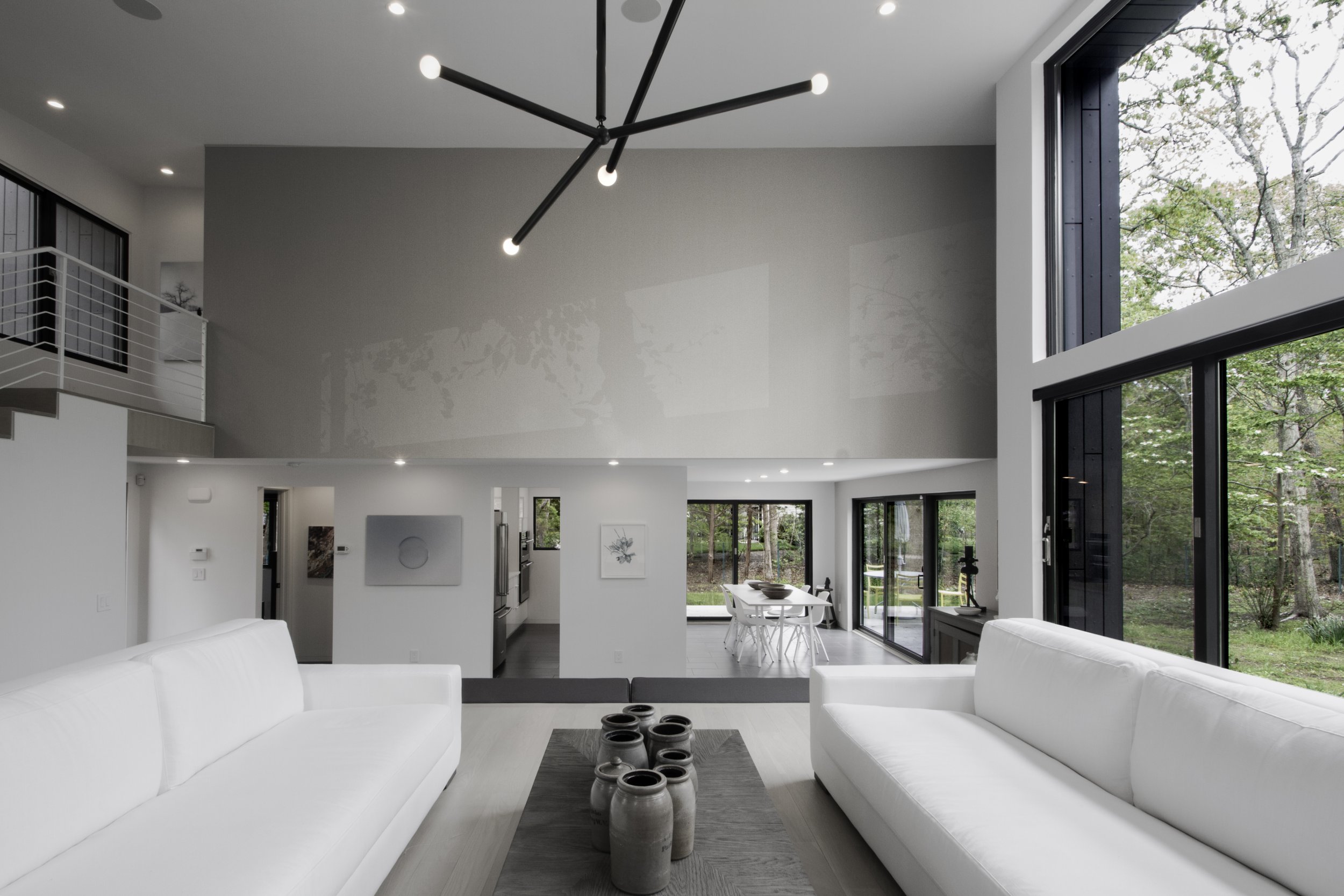
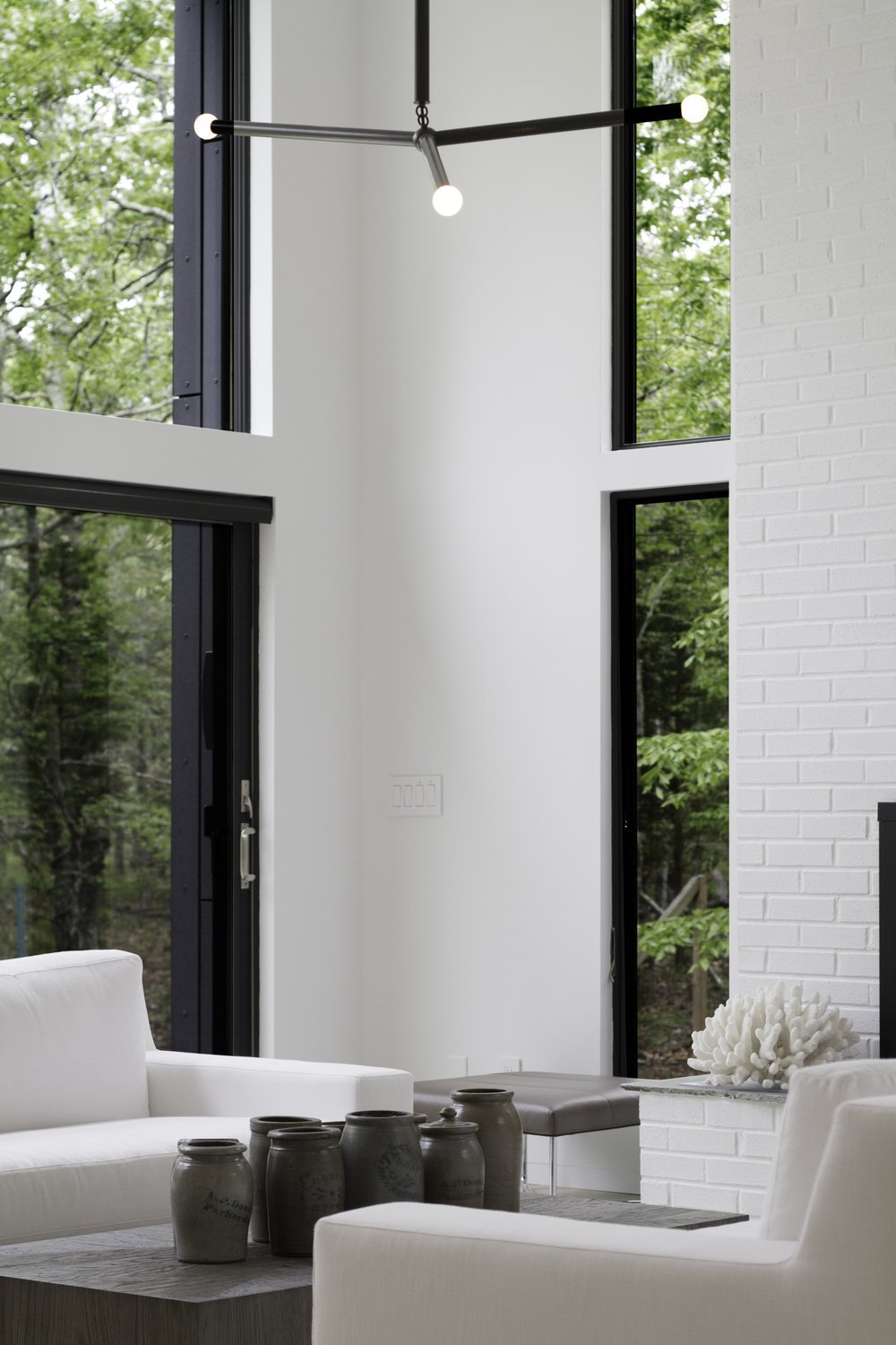
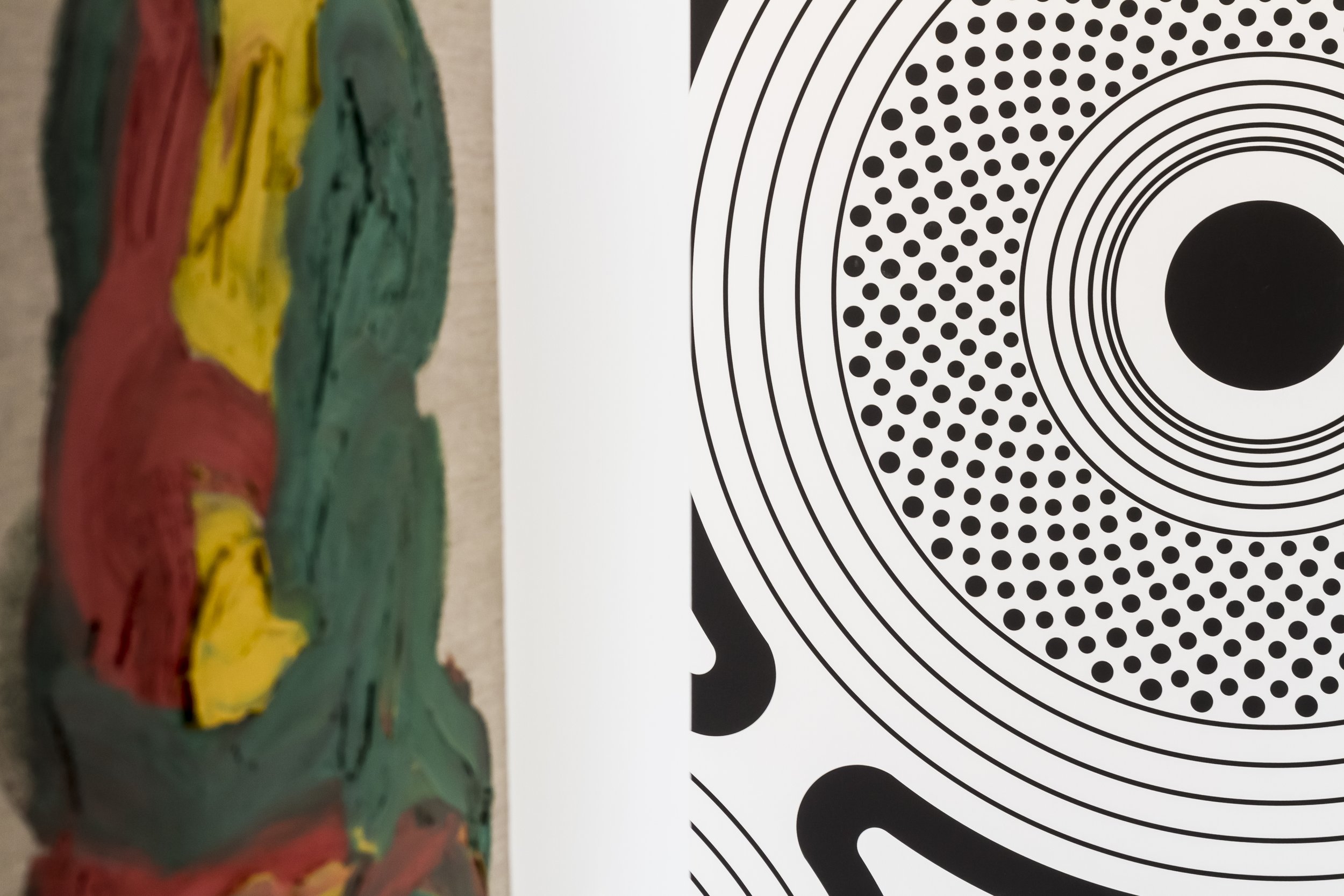
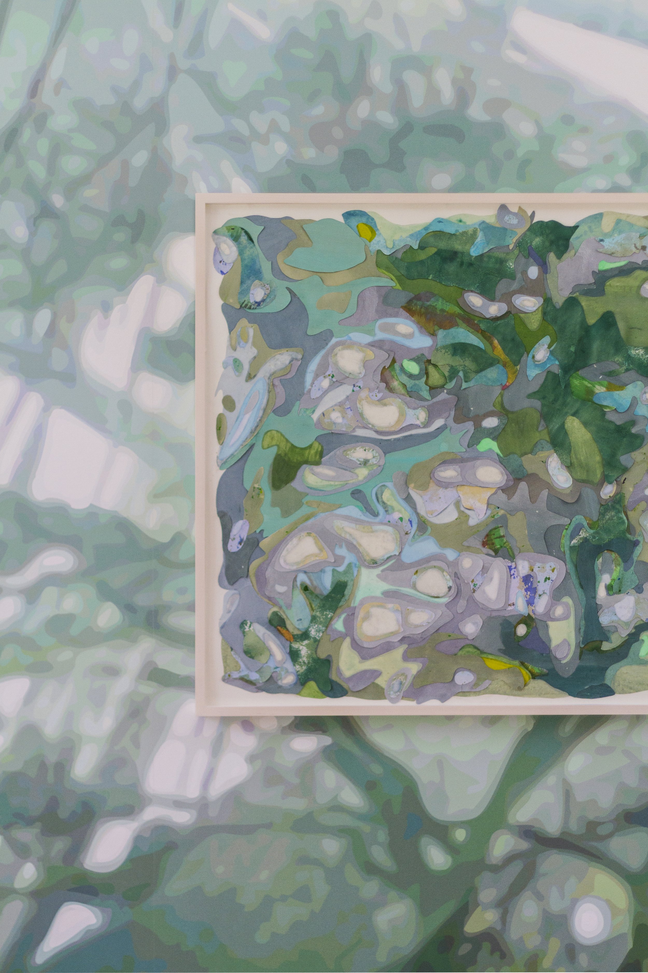
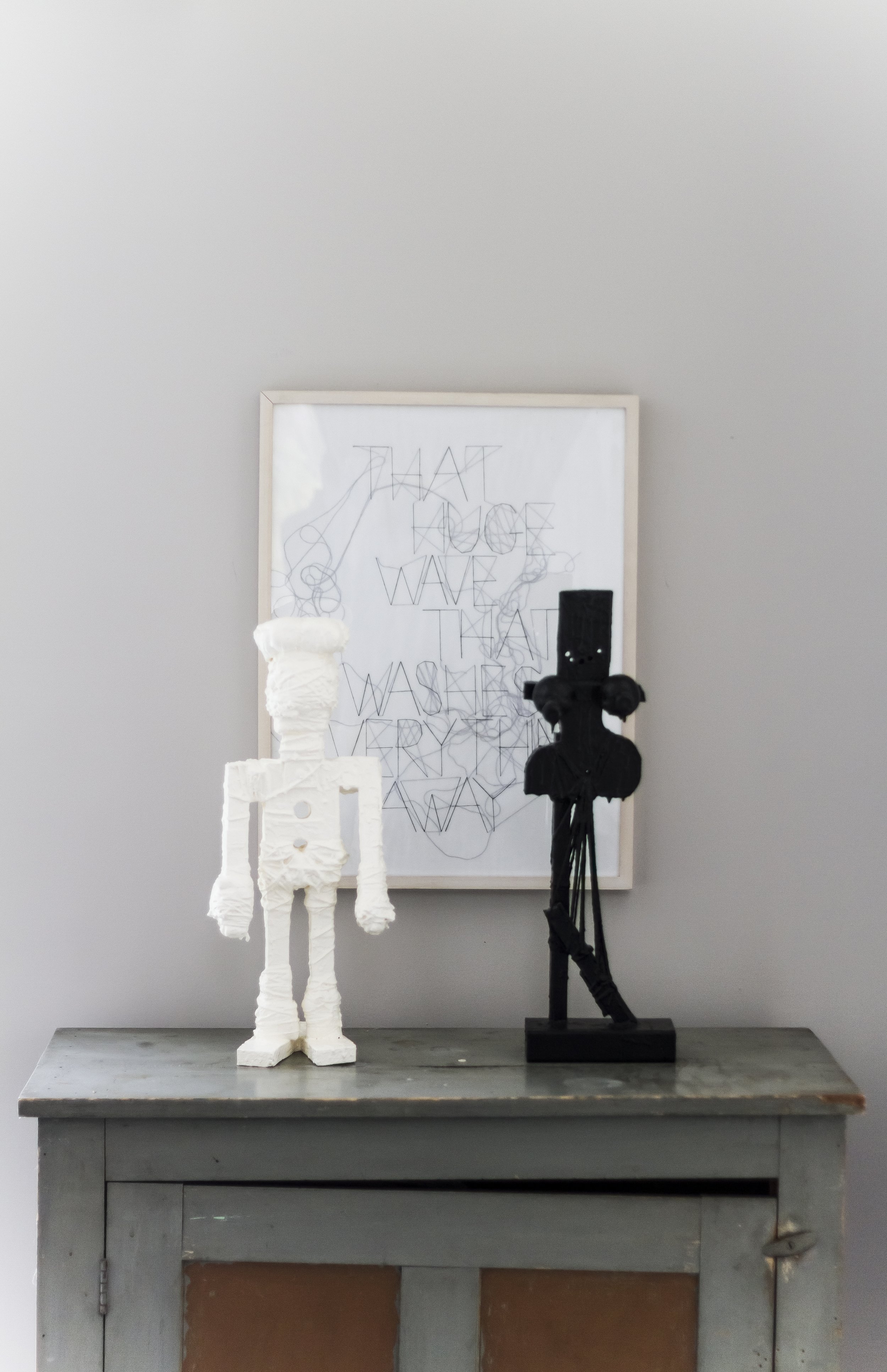
The redesign takes its cues from the client’s desire to create a living gallery space that would house their existing collection of artworks as well as serve as a canvas for several site-specific pieces commissioned specifically for the space. The most prominent of these are the two large scale murals that overlook the central double height living area, both of which draw inspiration from the views of the dense woods just beyond, framed by the new full-height, south-facing window wall in a playful dialogue between art and architecture.
The first, a subtle and ephemeral piece by the artist Mary Temple, echoes the play of light and shadow through the trees, while the second by artist Naomi Riis is a vibrant almost hyper-real representation of the natural world.
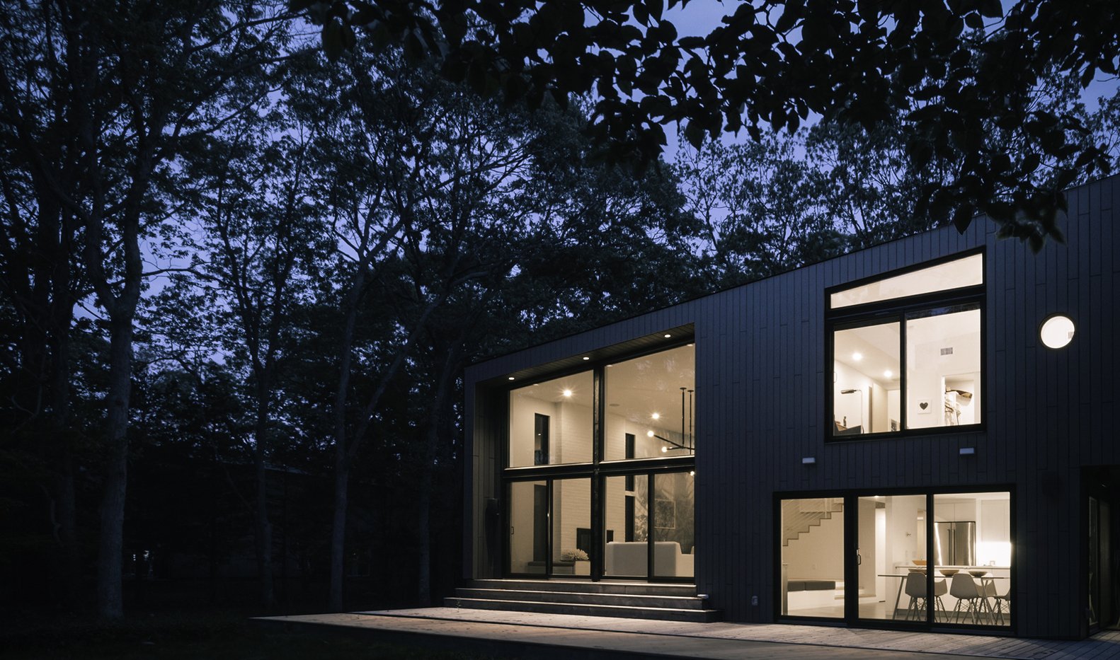
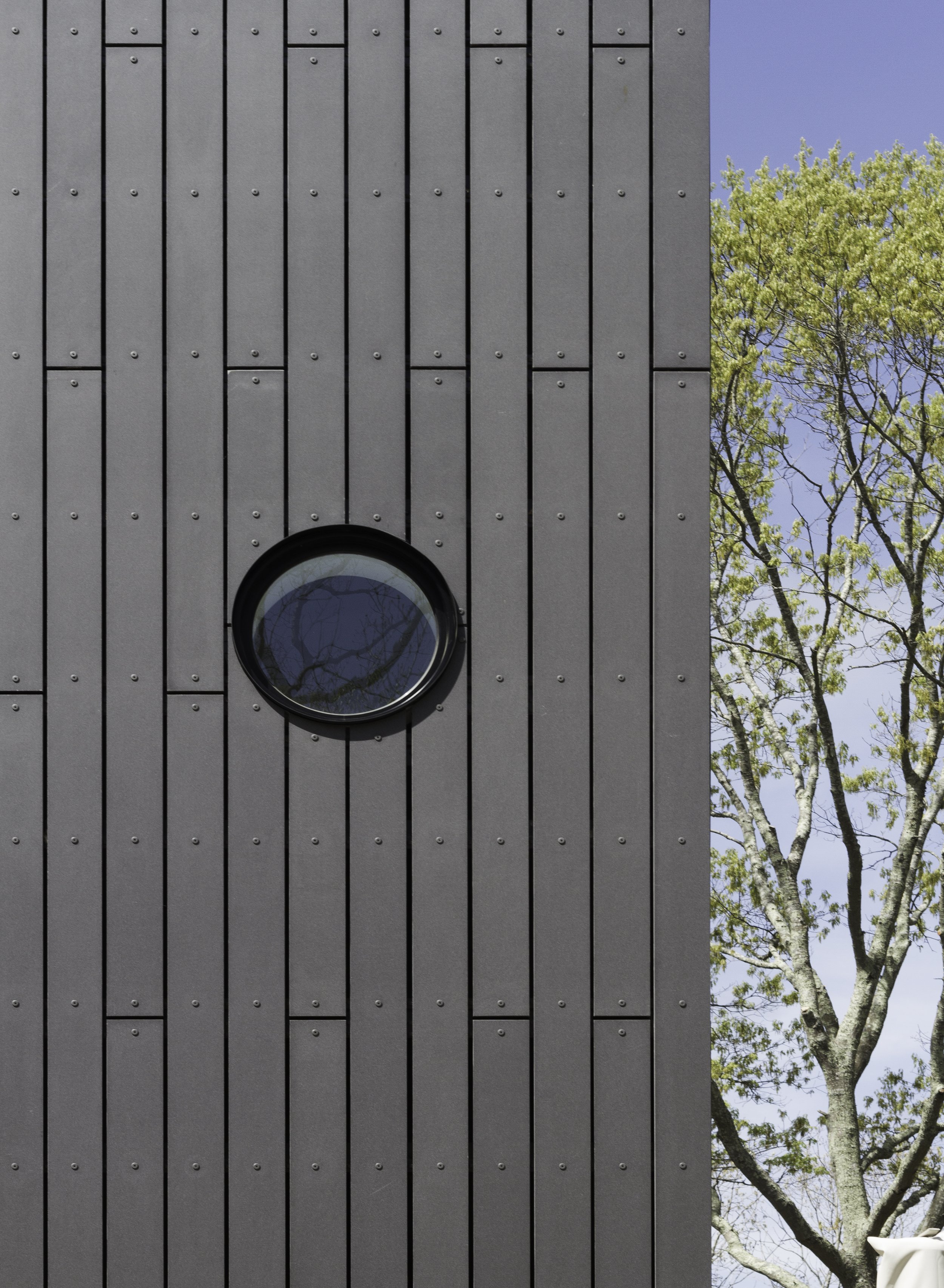
The existing vinyl exterior cladding of the house was replaced with a much more durable, charcoal grey GFRC rainscreen façade and the dining room glazing was extended to encompass the corner condition. The shape of the exterior openings was also modified to enhance their relationship with the extant canted roof line.
Notable reconfigurations to the interior layout include the reclaiming of a narrow and underused second floor circulation corridor which in turn allowed for the expansion of the master bedroom suite and the addition of a new en suite bathroom and walk-in closet. Banquettes at the edge of the living area are upholstered to compliment the main living room furniture and serve to activate a functional intermediate zone between the kitchen/dining and living zones as well as helping to visually define and demark the edge of the raised living area platform.
The theme of simplicity and lightness extends to the main stair to the second floor while the new “art wall” provides a new and ideal surface upon which to showcase artworks. The careful geometric order of the interior space and the minimalist material selection provide a powerful counterpoint to the lush, wooded exterior. By opening up and re-framing the north living room aperture, the line separating interior and exterior becomes increasingly insubstantial both visually and materially.

